This has definately been my best module. I've thoroughly enjoyed all the projects and I'm actually happy with my work. I'm more involved with my work now, and graphic design in general. I now find myself looking through books, websites and blogs at designers work just because I find it enjoyable, not because I'm looking for research. This has definately helped me a lot through this module.
What skills have you developed through this module and how effectively do you think you have applied them?
In the 'How to' brief, I got the chance to develop my drawing skills. This had been pushed asside this year and my work had been completely computer based. I've had a graphics tablet for a few years now and had been wanting to find a reason to use it and that project gave me the oppertunity to. This was completely out of my comfort zone but I was happy with my illustrations and they were still digital so I was able to develop them on the computer. These weren't the only illustrations I did during this project, I did a childrens version in illustrator which again I was very happy with and felt they communicated the instructions well. I even developed my bookbinding skills within this project, and descovered new ways to bind.
I've also experimented with illustration in the 'pure' poster for the Don't Panic competition. Again, this was completely out of my comfort zone and if I'm honest I really enjoyed it and loved my final outcome. This is something I would like to continue to experiment with in the second year and possibly over the summer holidays.
Type and grid almost forced me into developing my skills for InDesign. This was a program that I was very uncomfortable with using, but can now say I can use it effectively and even used it to put together my book for my Photography elective.
What approaches to/methods of research have you developed and how have they informed your design development process?
What approaches to/methods of research have you developed and how have they informed your design development process?
Throughout this module I have been constantly looking through blogs and websites at design, even if it's not any help to the current project, it's always helpful for future projects as I can refer back to it. This is also widening my knowledge of how I can approach a project, the methods I could use.
What strengths can you identify in your work and how have/will you capitalise on these?
What strengths can you identify in your work and how have/will you capitalise on these?
I think my main strength is definately my blog. I've used it pretty much everyday, recording ideas, thoughts, inspiration and my progress throughout each project. Not only has it helped me organise my work, but also been helpful with the feedback I've recieved on my posts. It's also nice to be able to look back at the work I've done through this module. I will definately be carrying this strength through into future projects.
I do feel as though my final resolutions always look professional. I don't really know whether this is because it's digitally produced but it's something people have been telling me, especially in the last project. This is definately something I'm happy about and will continue to develop in future projects.
Organising my work is definatly a strength of mine, I tend to work in a specific order, even in my sketchbook. This can also be quite restricting though. I have improved in this last module however, as I have been working more on design sheets and not limiting myself to my sketchbook.
What weaknesses can you identify in your work and how will you address these more fully?
What weaknesses can you identify in your work and how will you address these more fully?
My primary research has definately been a weekness in this module and throughout the year. My secondary research is brilliant and ongoing through all projects, however I really struggle with collecting primary research. I did a few questionnaires in the 'Speaking from Experience' project which definately helped determine the direction of the project, so I know collecting more will benifit me. This is definately one of the main issues I have and will work on resolving this in the next module.
Identify five things that you will do differently next time and what do you expect to gain from doing these?
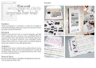
1. Although it has improved, my time management still isn't as good as what it should be. I didn't stick to the time management sheets I set myself. This is something I intend to address quickly as I know I could produce a lot more work in the time available, which will then benefit my final resolution.
2. Don't jump into a final idea so quickly. I need the research to back me up and development work to see what works and what doesn't. This could possible make my final resolutions more interesting.
3. Step out of my comfort zone more. I like to go with the resolution I feel most comfortable with so I don't end up getting it wrong. Maybe this is something I can do in the second year as it's more relaxed. There are quite a few methods I would like to experiment with.
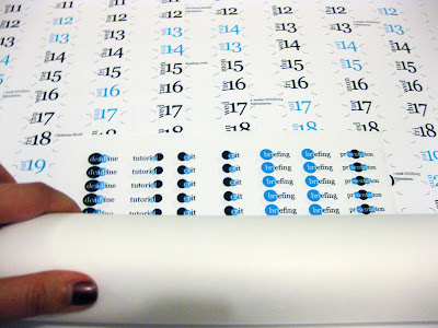
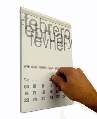
4. Screen print! This is one thing I've been wanting to do for a very long time. I wanted my final resolution for the 'Speaking from Experience' brief to be screen printed but I would need an A1 screen and they were all in use. I will make sure I get to do this in the near future. I may even screen print my calendar for personal reasons.
5. Collect more primary research. As I mentioned earlier, my projects lack primary research and I know I will benefit by collecting more.
How would you grade yourself on the following areas:
5= exellent, 4= very good, 3= good, 2= average, 1= poor
Attendance: 3
Punctuality: 4
Motivation: 5
Commitment: 5
Quantity of work produced: 4
Quality of work produced: 5
Contribution to the group: 3


 Easter Sunday - Bunny Ears
 Valentines Day - Holding hands
 Christmas Day - Baubles
 Halloween - Witches hat
 New Years Day - Firework


 I like this because of the scale, and the fact it becomes more of an art piece rather than a calendar.


