Wednesday 25 March 2009
Woodblock.
Monday 23 March 2009
A new brief.
Today we were paired with another pair. Me and Becca were paired with Lauren and Will and we represented our concept proposal, covering every possible detail and asking as many questions as possible. We all knew what was coming next and Fred confirmed it, we were swapping projects. With the impression that we would be taking on their project, we altered their brief to suit us, Lauren and Will doing the same to ours. After a few alterations, we were quite happy and looking forward to pursuing the brief, when Fred dropped yet another bombshell on us. We were swapping back and had to carry out our original brief that had been altered by Will and Lauren.
The Brief
Produce a promotional pack informing charities in the Yorkshire area of the production of a calendar containing information on charity events.
This should contain info relating to the calendars content, and invite the charities to submit dates and information for inclusion. A mock-up of the calendar should be included in some form (layout ideas/photography/physical sample).
Concept/Proposal
Get people to give more
Tone of voice
Clear and professional, but inviting to the respective charities, persuading them to be involved.
Deliverables
Development and research work.
Promotional pack including relevant information.
Calender mock-up.
Considerations
Must consider a suitable way for charities to submit their list of events (Form/E-mail/Website).
Calendar will produced for the year 2010. Any events submitted for inclusion must be organised to take place during 2010.
Promotional pack must be suitable for submission to local charities, either by post or e-mail.
Both the promotional pack and calendar mock-up must be designed with low cost mass production in mind.
Calendar should limit use of photography and illustration, using primarily typography to convey the message.
Friday 20 March 2009
Fun with stamps.
As were looking at woodblock type, I felt it was necessary to bring in my foam stamps to play around with for research.


We used them on our proposal boards, and they worked really well. It's made us more confident about using this technique in the final resolution.
However, although it was really fun, it was also really messy, and we got fingerprints everywhere.
Thursday 19 March 2009
Type & Grid.
Ok so, we had our first lesson in Type and Gird today which was really interesting. Didn't actually realise there was so much to take into account when working with typography. It was helpful, though. I would love to be able to have that much knowledge that I can tell what a typeface is, what the point size is etc, just by looking at it. I'll get there eventually I'm sure.
 Some research into typefaces:
Tuesday 17 March 2009
Layout Experimentation.
Just a few quick experiments with layout. I've just took the typography idea from my research and played with colour a little. Obviously we won't be using the type, it was just something to fill out the space so I could experiment with the layout.
Quite like the layout of this one. I've not included the days of the week though, which is something we would need to do.

Calender Research.
Monday 16 March 2009
Concept.
After doing loads of brainstorms, we decided to narrow our brief down to 'Get people to give more to Charity'. We felt it was relevant and had a lot of potential. We decided to focus more on encouraging people to attend charity events.
After handing out some questionnaires, we found that the main reason that people don't attend charity events is because they don't know about them. So, our concept...
Inform the public of local charity events.
Audience
Adults (19+) in West Yorkshire area.
How we plan to resolve it.
A New Brief - Communication is a Virus.
But this time with a partner.
My partner is Becca.
Task: Get people to give more.
Why have you chosen this task?
- Different interpretations of how it could be developed.
- More relaxed issue, less informative than the previous brief.
- Suitable and relevant to today.
What are my specific areas of creative interest in this task?
I would like to concentrate on making whatever we produce visually engaging. I would also like to experiment with combining hand-crafted work with digital.
What specific design skills do you have to offer in relation to your chosen task?
Idea generation
Digital imagery
Software skills
Layout designs
What specific non-design skills do you have to offer in relation to your chosen task?
Organised
Committed
Ambitious
Honest
What will your specific roles be in the collaboration in the relation to your brief?
Digitalising images
Layouts
What will your individual responsibilities be in relation to your brief?
Time management (timetables)
Sunday 15 March 2009
Yet Another Mock-up.
Saturday 14 March 2009
A new direction.
Ok, so I've changed my idea a little. I'm now aiming the book at parents so they are able to prepare an egg for there child to decorate. There isn't much I need to change really other than the language. So basically, I'm making a pocket guide for parents on how to blow out an egg.
Also, after talking to grandparents, I found that hollowing an egg is more commonly known as 'blowing out an egg', which is important to know now it's aimed at an older audience.
More Sketches.
Friday 13 March 2009
Sketches using a Graphics tablet.
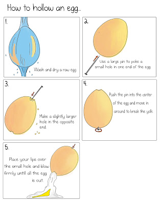
A few of us held a crit last week, and one of the things suggested was that I take some photos of the process of hollowing an egg and draw from them, so thats what I've done.


I quite like the quality of these a little more. Before I was trying to make them really childish and keep them really simple, but the more I looked at them the more I didn't like them. I think these are still suitable for children, however they're suitable for adults too, which is what I wanted as when in the crit, some people thought that children were too young to be doing this process on their own, and after trying it out myself, it was really hard to push in the needle, and blow out all the egg with the possibility of getting it in your mouth.
I think these are more instructive/informative than the other illustrations I did. Not sure if they're informative enough to work on their own though, I think I'll need to add some text. I'll do a survey and find out what others think work best.
Thursday 12 March 2009
Easter Egg Box.
My original idea was to attatch a book to the packaging so that children could take it off and keep it for further use, but as egg decoration is only done at easter, I thought just having them on the back of the packaging was more necessary. On the easter egg box I looked at, the back was full of games and things children could interact with, so it would go in replacement of that.
I haven't actually made it, this is just the design I drew on photoshop. I think this idea is suitable, but I don't think I will have the time to complete it to the standard I want it.
Wednesday 11 March 2009
Illustrations.
Tuesday 10 March 2009
Mini Crit.
A few of us got together for a crit as they'd been cancelled and we felt we needed one. Was really helpful and nice to just sit in a small group and have discussions.
Things mentioned:
- Add more arrows to my illustrations as they're quite hard to understand.
- Take photos of the process of hollowing an egg and draw from them
Hollowing an egg.
I've been putting this off because after watching a few videos on youtube it really didn't look like a pleasant experience. I knew I had to do it, though, in order to do this brief effectively, I needed to know what the process was like in order to instruct properly.


It was helpful. I realised it wasn't as easy as it looked and possibly not really what a child should be doing. However, it was children I saw on youtube doing it.
Easter Eggs.
I've been looking a lot into packaging and there really couldn't of been a better time for me to get this project... It's coming up to Easter.
One of my ideas was to include the instruction book on the packaging of an Easter egg. Easters the only time that children decorate eggs so I thought it would be quite appropriate. Anyway, I've been and bought an easter egg so I could look at possible ways of including it in the packaging.
It was also an opportunity to look at the illustrations, fonts and type of language.
On the side and back of the box were games for the children to interact with. This is something I could do, include the instructions on the back of the box, this way there would be no need for a book.
Thursday 5 March 2009
Children's Books.
The land of the Lullaby, illustrated by Ryan Haralson.
To give me more of an understanding into what types of illustrations are the most suitable for children, I've been looking into children's books. I come across this one and thought it was lovely. All hand drawn and even coloured in with crayons. The font is really 'childish' aswell which is something I need to take into consideration.

If you give a cat a cupcake, illustrated by Felicia Bond.
I found this particular page interesting because the illustration clearly shows the story, which is what I need to do for my instructions.
Subscribe to:
Posts (Atom)


